The newsletter
Each edition paired practical resources — caregiving guides, industry updates — with community programming like local seniors' events, plus a recap of Carebee's own member meetups.
The goal was to give both seniors and the family members who often forward these emails along a reason to open every send.

Competitive research
Carebee hadn't settled on its MVP yet. I researched other companies in elder care — what they'd built, who they sold to, and how they made money — to help the two-person team see what a working model could look like.
That research fed directly into product conversations and into decisions about what the landing page needed to say.
Landing page
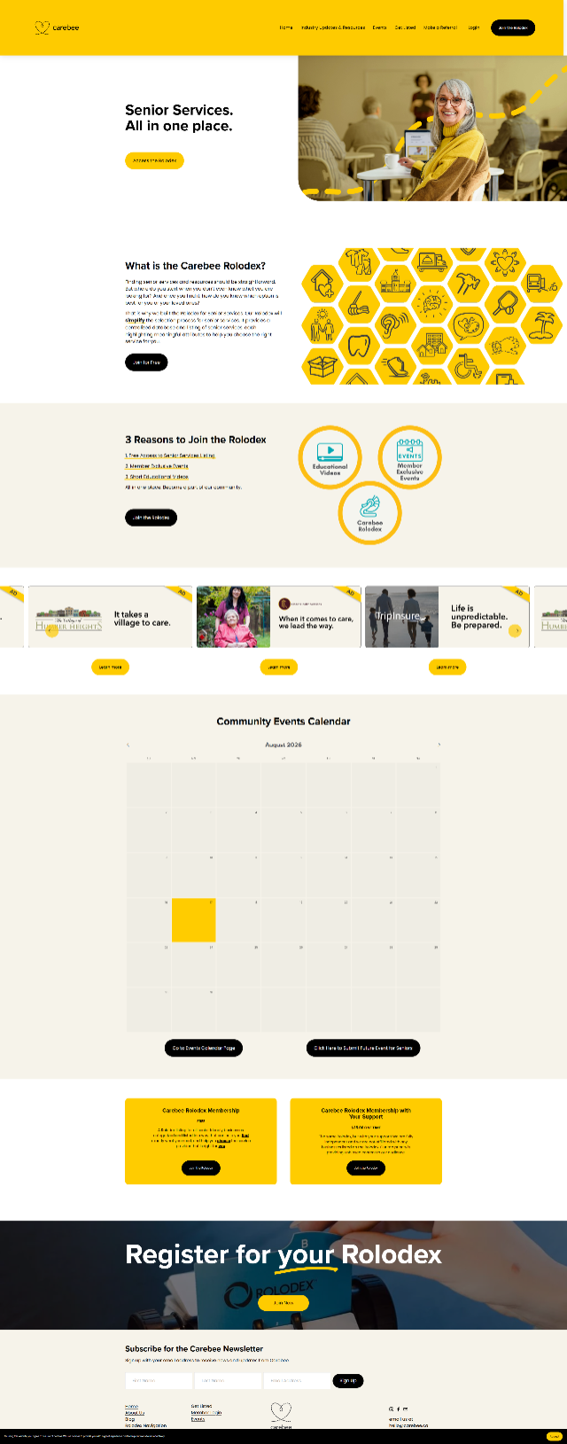
Carebee's landing page has to work for two different readers at once: seniors themselves, and the adult children often doing the research on their behalf. I contributed to the page with that split audience in mind — clear enough for a senior to trust, direct enough for a busy adult child to act on.
The hero leads with one line and one action — "Senior Services. All in one place," then Access the Rolodex — so someone skimming on their phone knows what to do before they even scroll. "What is the Carebee Rolodex?" explains the idea in plain language before asking for anything. The ask itself only shows up near the bottom, as a free tier next to a $25 supporter tier — free by default, with an easy way to pay if someone wants to.